Redefining Neutrals With Designer Megan Molten
Translation missing: en.blogs.article.author_on_date_html
Living
Redefining Neutrals With Designer Megan Molten
September 21, 2022
If, in the midst of an interior project, you’ve ever asked yourself, “What even constitutes a neutral, anyway?” you’re not alone. Creating an interior palette that feels warm, personal, and timeless all at once is overwhelming, to say the least, so we spoke with none other than Megan Molten—luxury designer and expert on all things neutrals—for a guide that could, once and for all, answer all our queries for curating a versatile interior. For her invaluable breakdown on when to keep it neutral, when to take a risk, and when a neutral itself can be a risk—but a rewarding one at that—keep reading, and be sure to bookmark for all your future design endeavors.

Redefining Neutrals With Designer Megan Molten
Rip & Tan: Let’s start with the absolute basics—how would you define neutrals?
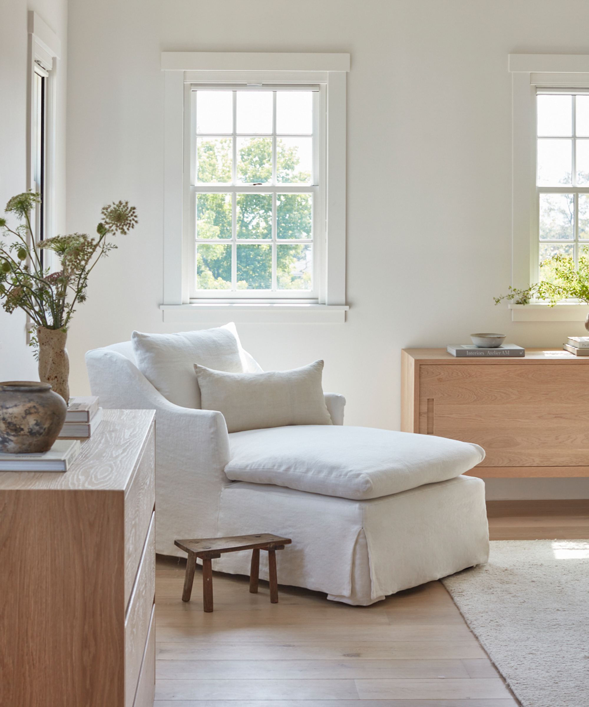
Megan Molten: I define neutrals as your foundation pieces that are modern, timeless, clean and provide the perfect blank canvas to layer color on top of.
Rip & Tan: Are there different classifications of neutral tones?
Megan Molten: Yes, absolutely. When we do a project with only neutrals, it lays the foundation for that project. Are we going for a warm or cool palette? That classifies the neutrals and is the first decision so you can then layer the colors on top of that.
Rip & Tan: Neutrals often have an unfair reputation as the safe—or perhaps even boring—interior route. Why do you think that is? Is there a way we can reframe neutrals to give them the respect they deserve in interior design?
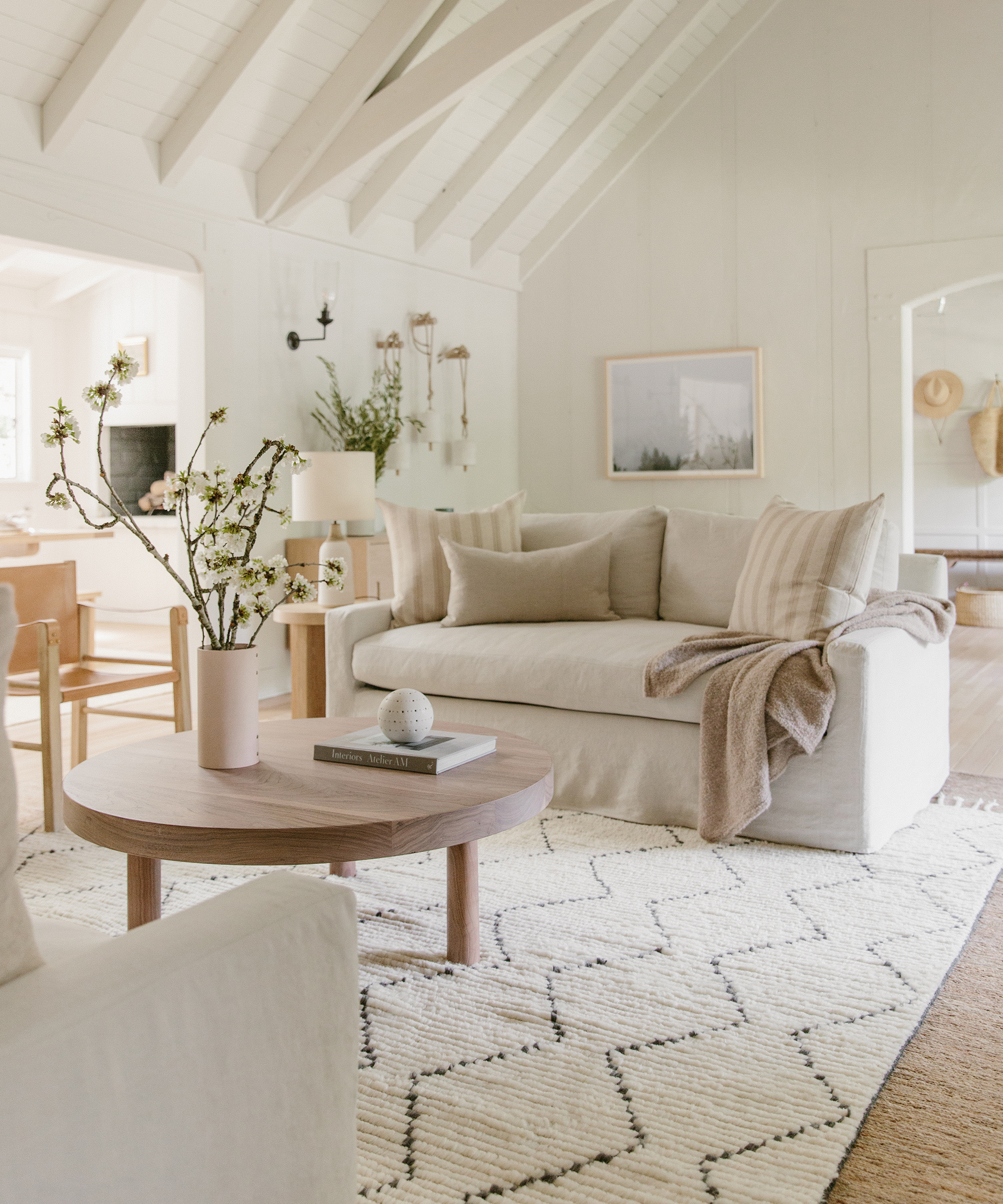
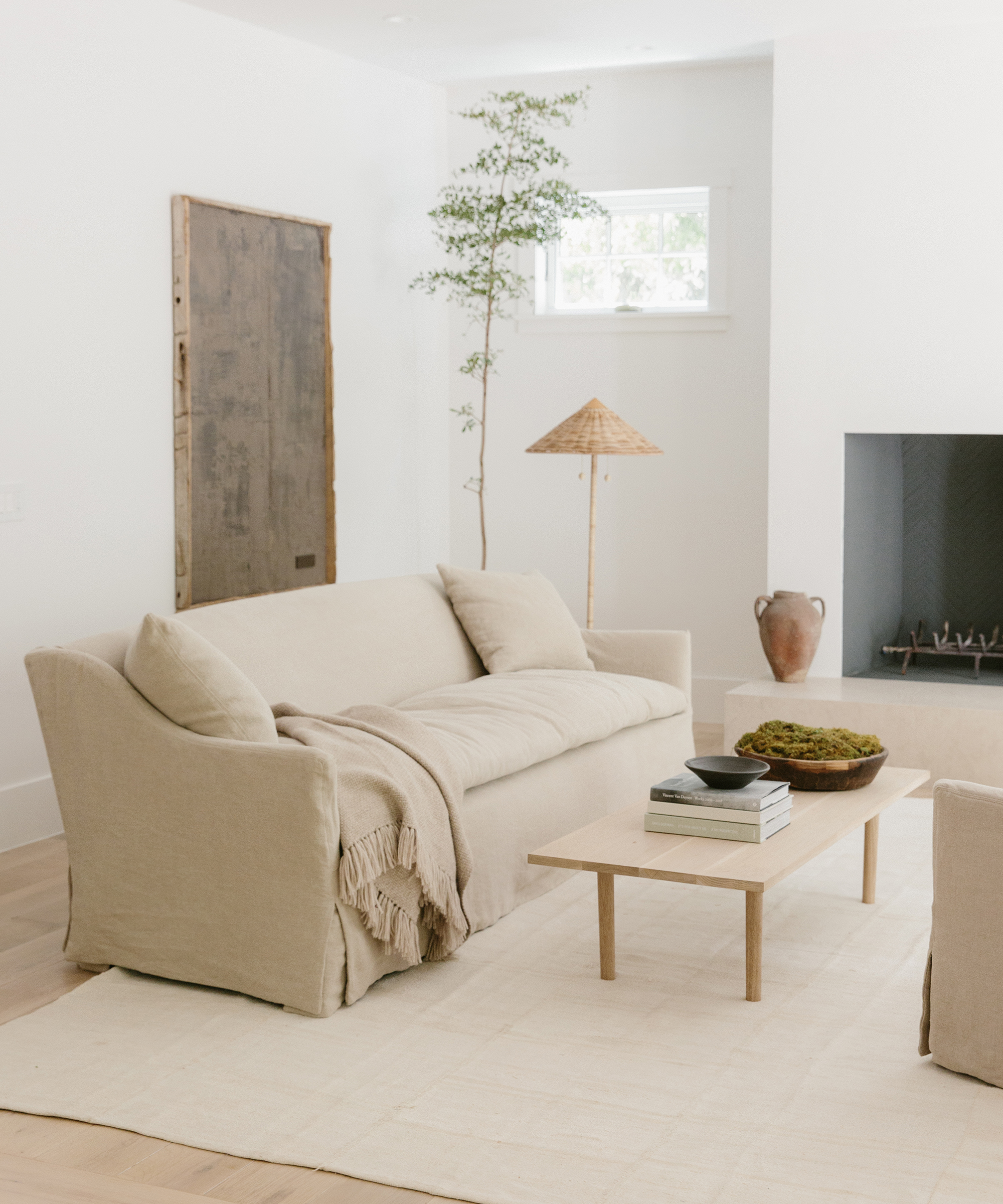
Megan Molten: The best way to keep neutrals from being boring is layering different textures, prints, and patterns when you’re sourcing your neutral pieces.
Also, thinking about using unusual shapes throughout the space can create more versatility and make your neutrals more fun and modern.
Shop the Story
Rip & Tan: Can you tell us more about the role that texture plays when designing with primarily neutral tones?
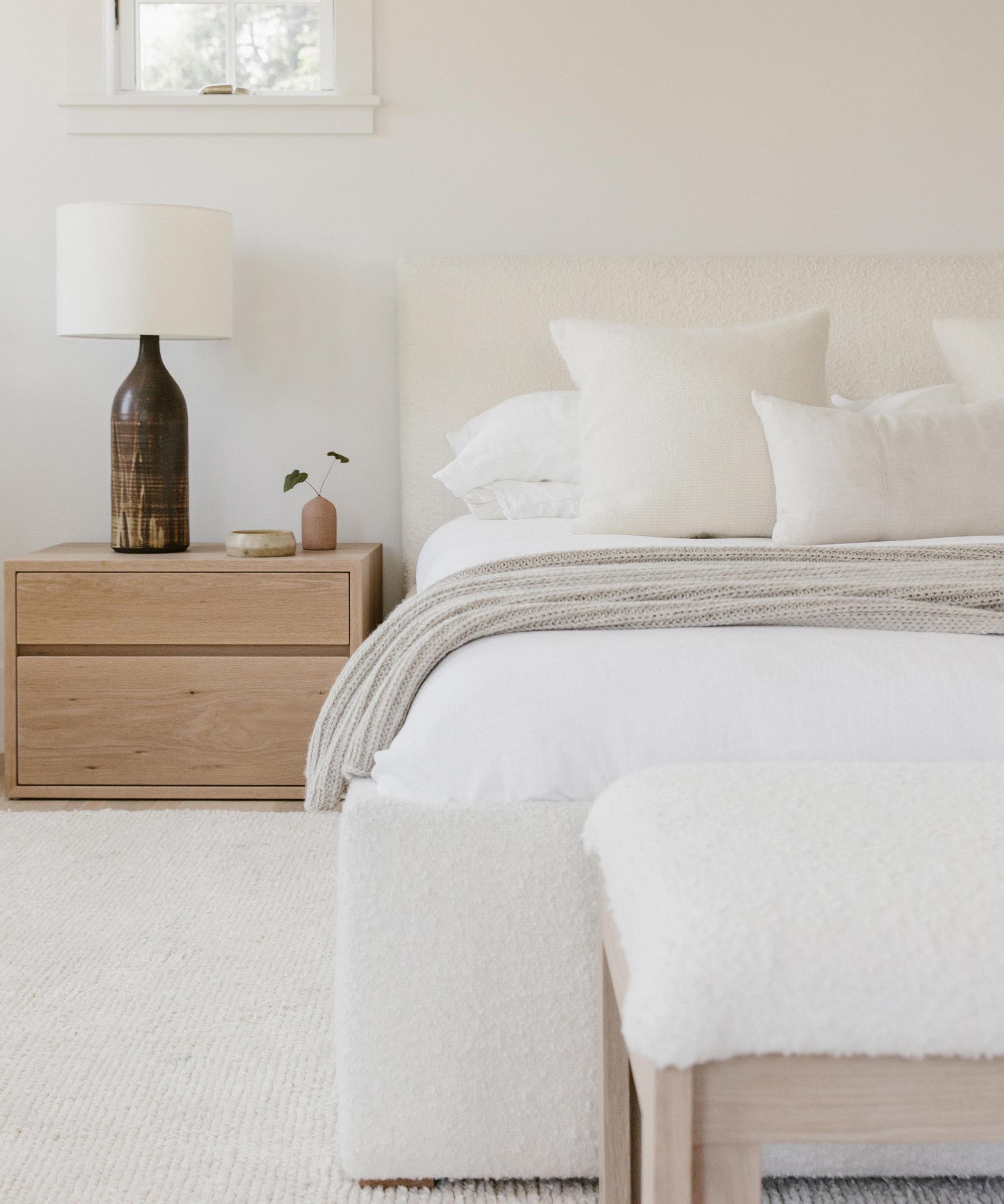
Megan Molten: I love using texture in our neutral spaces to create depth. Typically, I am sourcing texture through furniture pieces that include some sort of woven material, whether it’s rattan, grasscloth, or linen.
I also love Shagreen and Hair on Hyde pieces. I found that these furnishings are interesting, unique, and different. My clients usually gravitate towards them because of that. It’s not the common lacquered or wood piece. It is more outside the box.
Rip & Tan: For those worried about the maintenance of a palette of whites and ivories, do you have any tips for keeping lighter neutrals in pristine condition?
Megan Molten: Performance fabrics are essential to use if you have lighter neutrals in your space, children, and/or pets! Most of our clients have young children and pets, and they all want lighter fabrics.
Performance fabrics are our go-to for these pieces in order to give them the look they want, as well as the durability they need. Performance fabrics have come so far and provide the same softness and luxury as non-performance do. This is why they have become a go-to in the upholstery world!
Shop the Story
Rip & Tan: When in doubt, what elements of a home are best kept neutral, and where are some never-fail places to incorporate a bit of color?
Megan Molten: I love to incorporate neutral pieces in the main living room space of the home and bring in the color through throw pillows, rugs, artwork, greenery, and accessories.
Rip & Tan: Are there any materials or finishes that tend to lend themselves better to a neutral colorway?
Megan Molten: Definitely incorporating woven fabrics, such as a rattan piece. Now, there is the option to go warmer or cooler with those pieces depending on your palette and the space.
There are more options available than ever before because woven pieces have become so popular over the years.
Shop the Story
Rip & Tan: What are some of your favorite neutral paint shades and fabrics?
Megan Molten: Megan Molten White by Sherwin Williams is my favorite paint shade.
I created the perfect white that doesn’t have too many cool or yellow undertones. It refreshes any space!
Rip & Tan: Do you have any other general rules for designing interiors with neutrals in mind?
Megan Molten: My advice when it comes to using a neutral palette is to turn to white paint—it’s always a good idea when paired with neutral fabrics.
Take your risk on art, rugs, and accessories. They can always be changed and moved around!
Shop the Story
Photos by Angi Welsch and Nicki Sebastian