Behind the California-Inspired Design of Soho Home
Translation missing: en.blogs.article.author_on_date_html
Living
Behind the California-Inspired Design of Soho Home
February 11, 2022
When it comes to a dynamic and all-purpose home goods store, or in this case, an NYC furniture store, our flagship Jenni Kayne Home store in Soho, New York is everything and more. In fact, Soho Home was named one of the best home stores in America by House Beautiful. With a focus on lived-in layers, organic materials, and minimalist design, we transformed the Soho space into a California-inspired haven that feels just like home. Read on for more design details and expert tips from John Contreras, our Director of Visual Merchandising and Interior Styling—and don’t forget to visit us at 125 Greene Street.
Behind the California-Inspired Design of Soho Home
There's No Place Like Soho Home
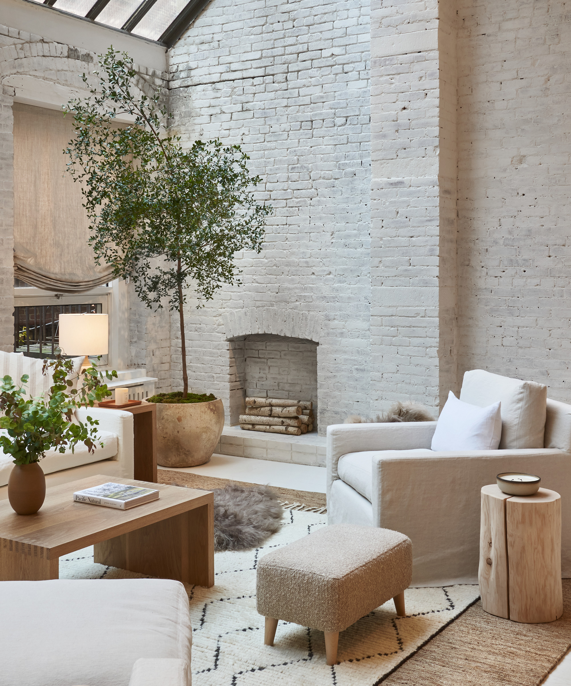
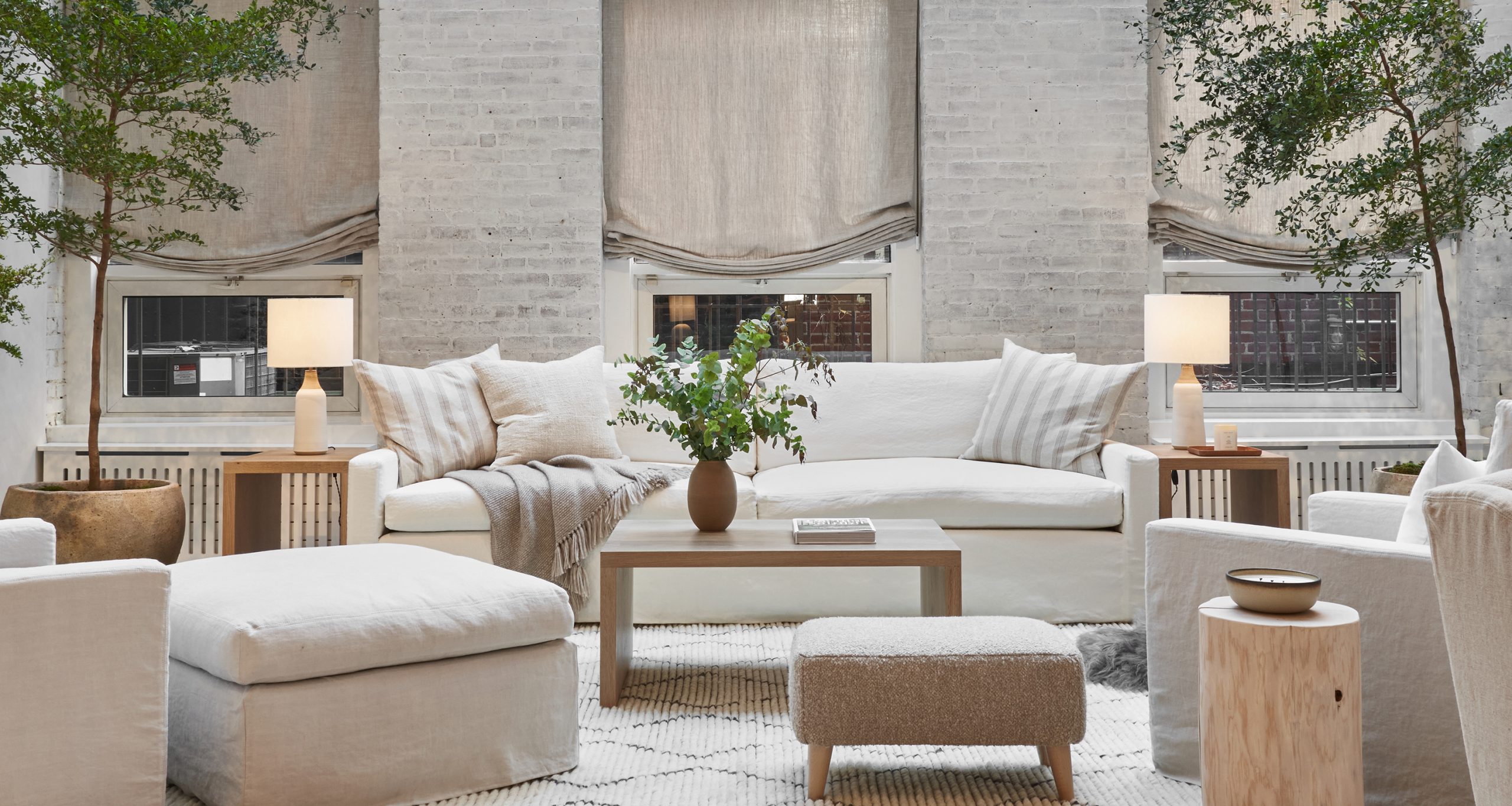
We honored existing architectural elements like high ceilings, hardwood floors, and brickwork, but put our signature spin on every inch through thoughtful details and expert styling—plus a fresh coat of color from Portola Paints (Burrow in Roman Clay and Gem in Roman Clay, to be exact). Vintage lighting and pendants from Rose Uniacke brighten the space, while real-room environments take shape through British Standard kitchen cabinetry, Waterworks fixtures, an eye-catching tub from Native Trails, and Arto Brick tiling.


Rip & Tan: With its high ceilings, vintage fixtures, and timeless neutral palette, the Soho Home store is a true sanctuary in the heart of the city—tell us a bit about working with the team to create the space. What was the original vision? Where did you look for inspiration?
John Contreras: For me, Jenni’s new living room was a huge inspiration. It feels incredibly calm and soothing, and is very spacious while still feeling intimate, especially thanks to the warm, neutral colors. Creating a serene environment in the middle of the city seemed like a perfect way to introduce Jenni Kayne Home to New York.
Rip & Tan: Can you tell us which plants you brought into the space? What’s your philosophy for bringing the outdoors inside in a way that feels complementary to an overall design?
John Contreras: We used Black Olive trees, which Jenni and I both love, and placed them under the large windows in the back of the store. It’s great having that height in the space as it helps draw the eyes up as all the furniture is much lower. They require a fair amount of light so it was a perfect placement.
I feel that the sculptural quality of trees and some plants can almost feel like works of art, and one large tree in a room can be a great statement that adds color and a sense of nature. My favorites are older species that have some uniqueness: ones that might lean over in a certain direction or have some wayward branches—they all add character.
Shop the Story
Rip & Tan: In what ways is the store influenced by the spirit of New York, or Soho in particular? Is there a specific feeling you hope it evokes?
John Contreras: The building itself is historic, and the large, slanted windows in the back of the store have a very New York feel. Using the light-drenched space under those windows was the perfect location for our main seating area.
Choosing our neutral-colored linen slipcovered furniture with white oak tables and accents conveyed a sense of California minimalism in a natural way.
Rip & Tan: Walk us through your process. What elements typically guide the way your designs develop?
John Contreras: Taking the style of the building and the bones of the space into consideration is always the first step. For a store and also for a room at home, the placement of the furniture should feel inviting and natural in the way you enter each room.
For the main seating area, we went with our natural-colored linen and white oak furniture to give it a light, open feel. For the smaller seating area, we chose the slightly darker flax linen and walnut to create a darker, more intimate experience.
Shop the Story
Rip & Tan: What’s your general approach to textiles? Any go-to textures for effortlessly adding warmth to a space? How does this come to life in the Soho Home store?
John Contreras: Playing around with textures is a great way to add interest to a space, especially if you are using muted tones. Linen, boucle, and natural textures like our Luna Pillows and Alpaca Basketweave Pillows add a lot of variety to a setting.
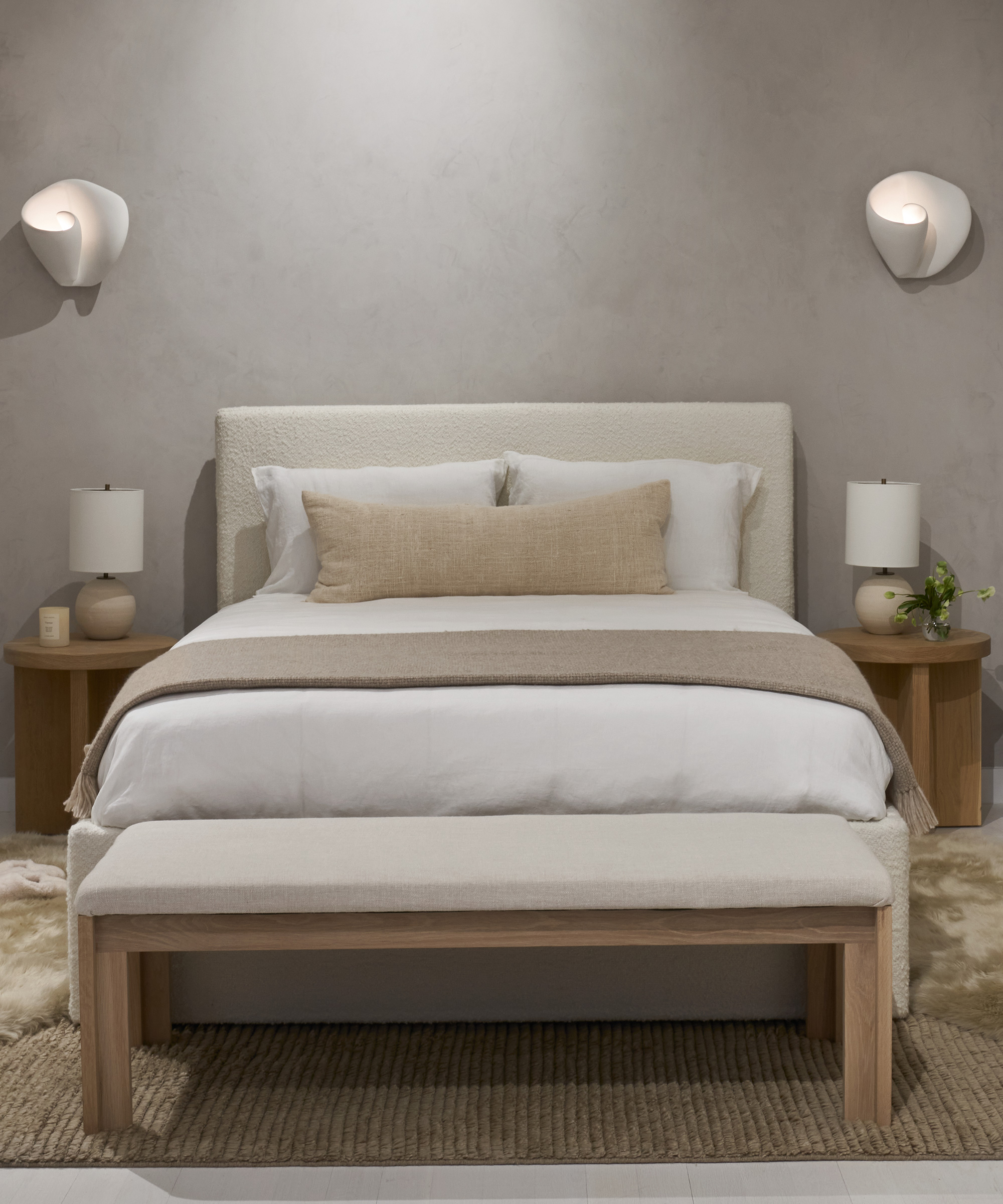
We combined all of these in the seating areas as well as the bedroom downstairs. The bed itself has texture, then we layered square and lumbar pillows with a throw, all in different fabrics which work well together. Our Brentwood Chairs come in two shades of wool boucle, and mixing those in with other linen pieces adds variety while still being cohesive.
Rip & Tan: A rug can make or break any room. Do you decide on a rug before furnishing or vice versa? Any tips for finding a foundational rug that grounds a space?
John Contreras: I find it best to start with the rug and window treatments. Ideally, there should be about 18” of space from the rug to the walls in a typical living room. A jute rug is a great choice for a living area as they wear very well. It’s also a great foundation if you want to layer a smaller rug on top. We used the Nala Rug from Armadillo which adds a pattern without overwhelming.
Shop the Story
Rip & Tan: From the statement furniture pieces to the small styling details, what aspects of designing the store were the most satisfying to see come to fruition? And the most challenging?
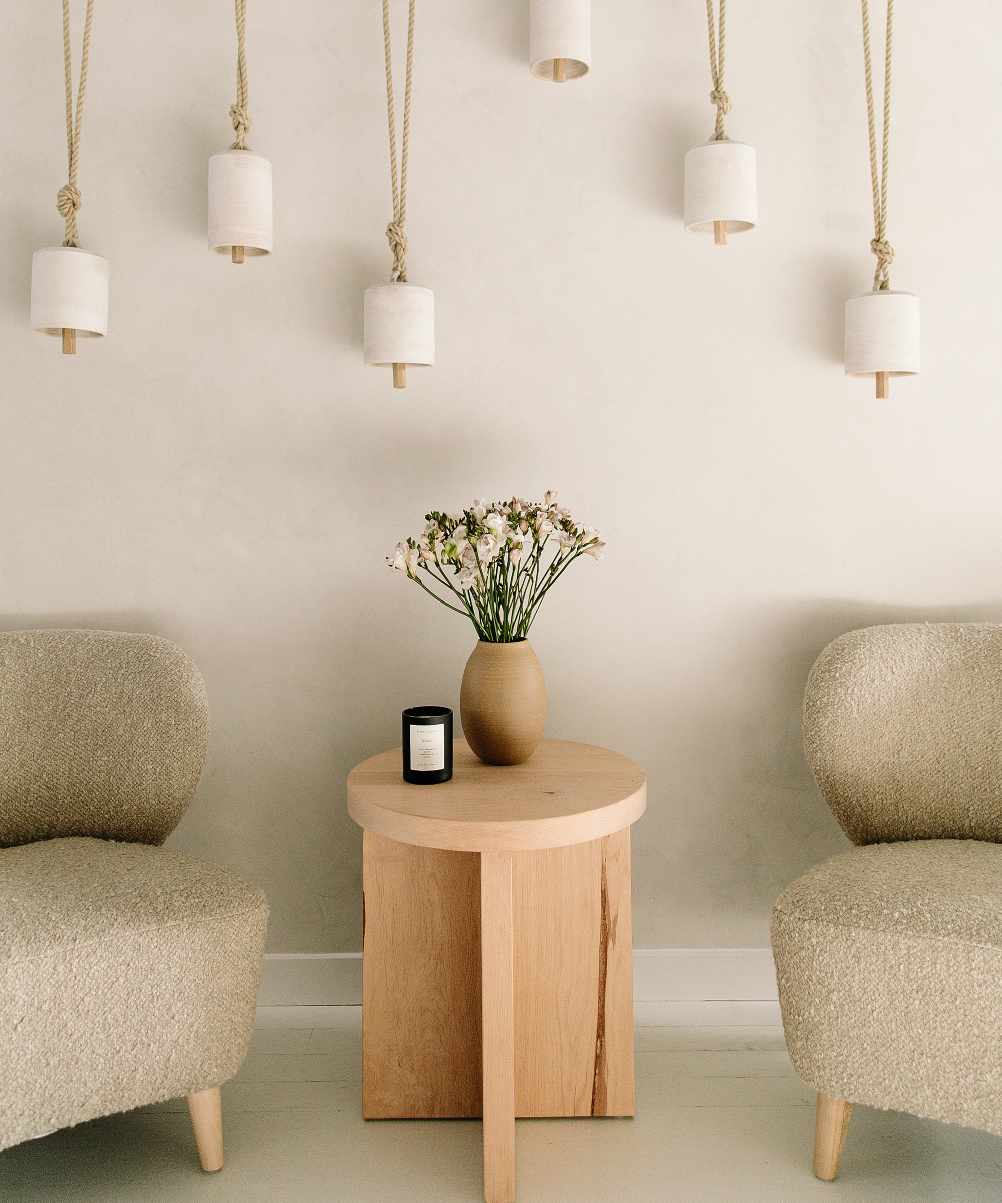
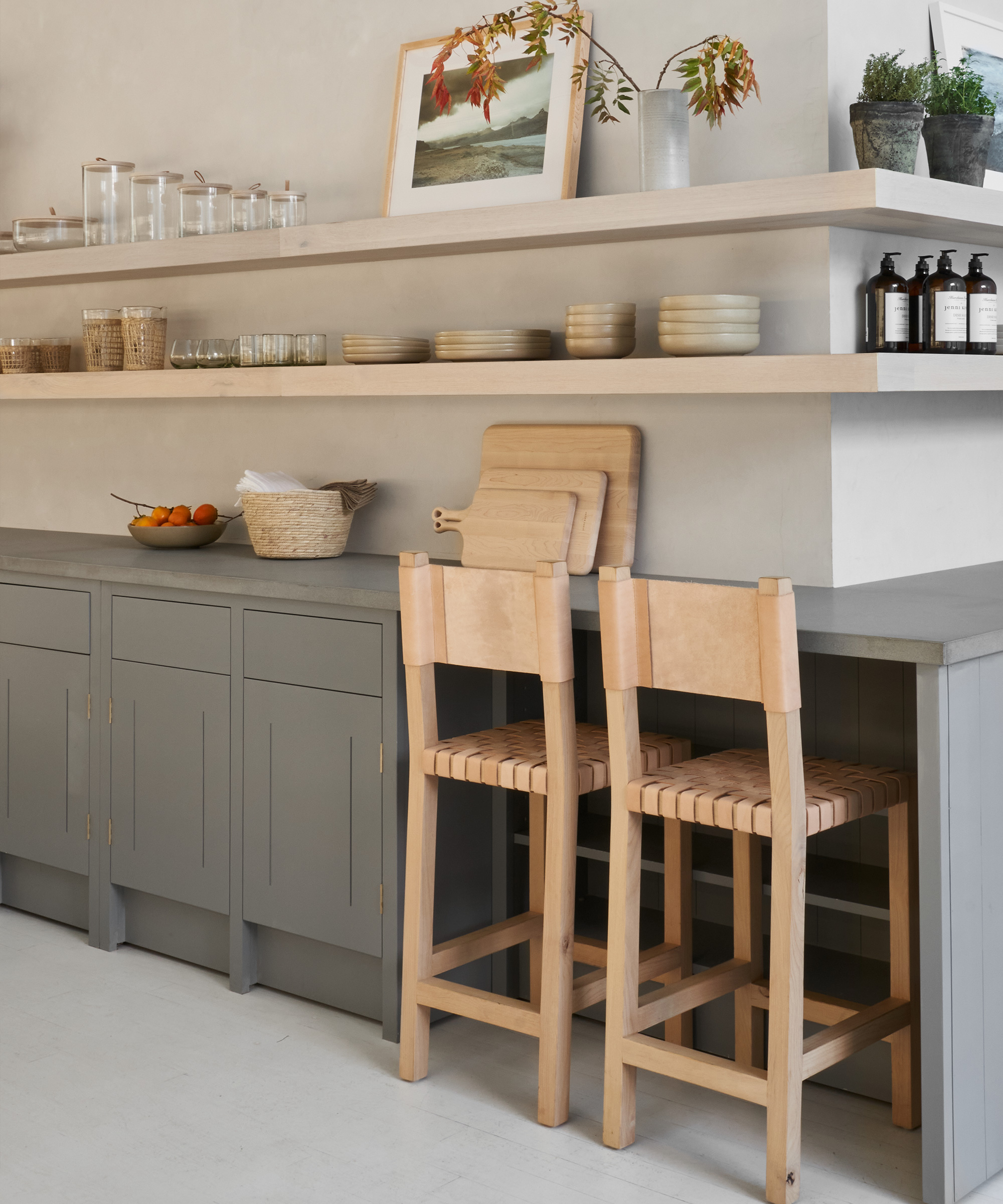
John Contreras: The main seating area with the trees under the wide window was very satisfying to see completed, but also the little moments in smaller spaces. In the walkway in the middle of the store, we have a pair of our Brentwood Boucle Chairs, a Marin Side Table in the center, and some Mquan bells hanging on the wall behind them.
It’s a very simple combination using just a few elements, but works to great effect. We used Portola Paints’ Gem in Roman Clay for the plastered walls on the main floor, and they were so beautiful. So much so, it was difficult deciding on where to hang art because we did not want to cover up the gorgeous texture.
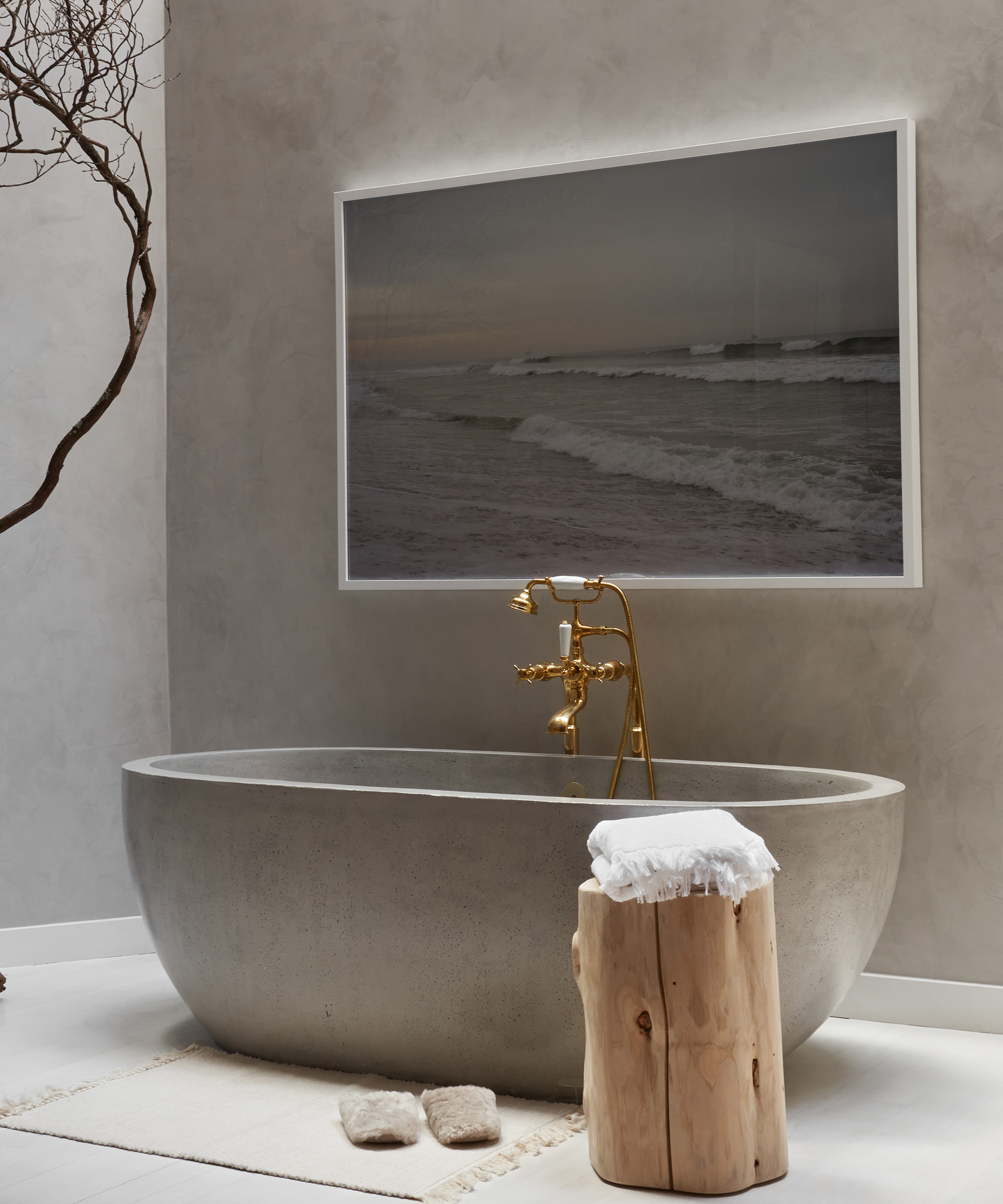
Rip & Tan: We were lucky to work with some amazing partners to bring Soho Home to life. From the kitchen details to the bathtub, can you tell us a bit about your favorite elements?
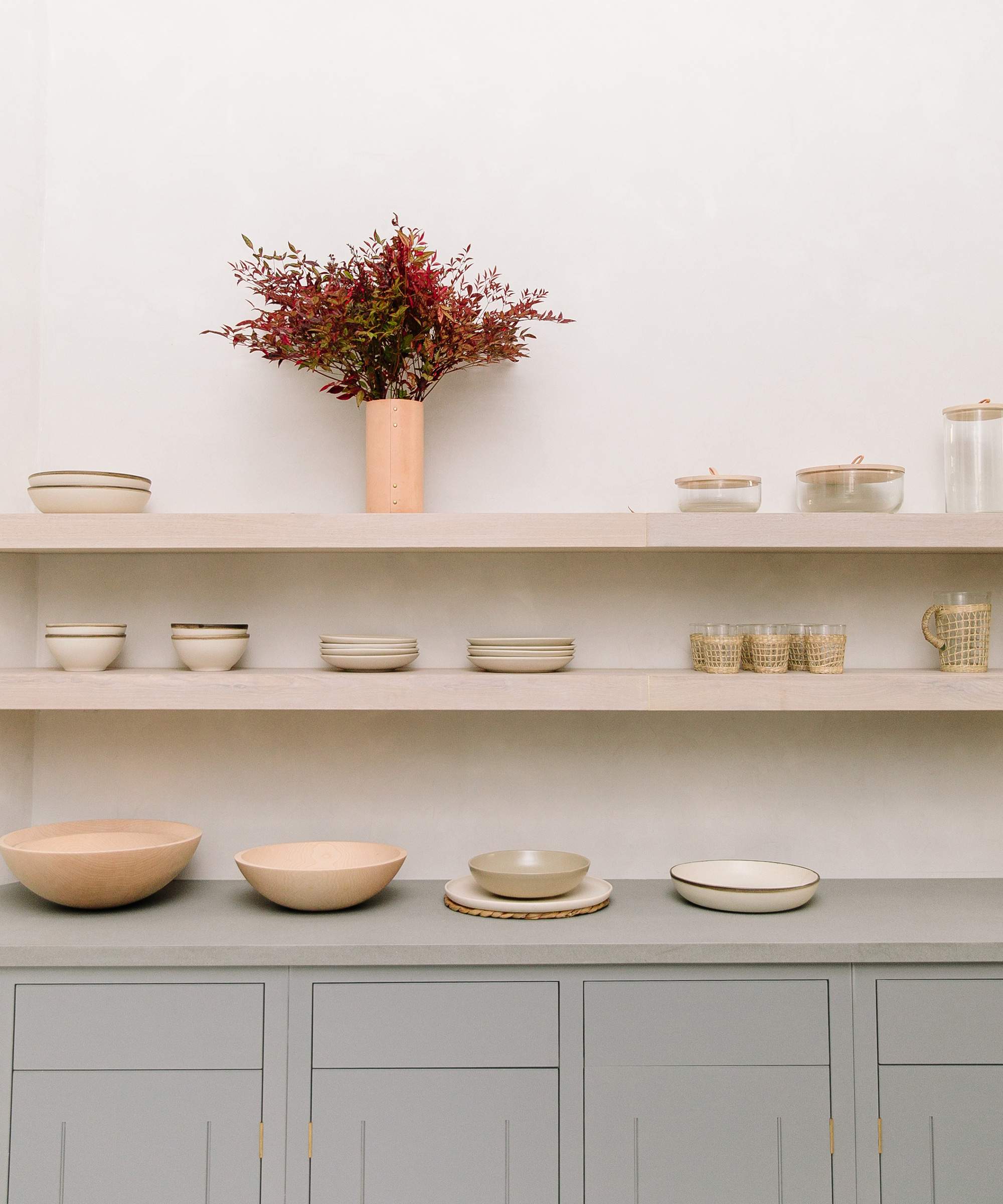
John Contreras: The kitchen cabinets are from British Standard in a beautiful shade of blue called Albert Park, which gives depth to the space and compliments the grey countertop. We installed open shelving that wraps around the wall, giving us a lot of room to display stacks of dishes, canisters, and glasses in a practical but also decorative way.
Jenni sourced all of the lighting in the store. The tulip wall sconces by Hannah Woodhouse, which are used on either side of the bed, are some of my favorites. Their curving shape works effortlessly in sync with the softness of the Pacific Bed in Ivory Linen.
Shop the Story
Photos by Julia Robbs