Our Complete Guide to the Best Moody Paints
Translation missing: en.blogs.article.author_on_date_html
Living
Our Complete Guide to the Best Moody Paints
August 12, 2022
Whether you’re determining the atmosphere of an entire room or adding a touch of intrigue in a smaller way, to say that navigating paint is overwhelming is a true understatement. Venturing away from more typical palettes into deeper, often unexpected hues adds an entirely new layer of questions and considerations—which is why we went directly to our in-house interior designer, Linnea Schooley, for help simplifying the process. From deciding on the perfect dark grey paint color to choosing a way to work with unfamiliar living room paint ideas, her expert guidance on approaching the cozier end of the color spectrum has something for everyone.
Our Complete Guide to the Best Moody Paints
Rip & Tan: Let’s start with the basics: what are your favorite moody paint colors?
Linnea Schooley: Portola Paints: Beachwood, Oliver, Burrow Roman Clay, Sasha Roman Clay, Maison Roman Clay, Nitty Gritty Roman Clay, Eastwood Limewash.
Sherwin-Williams: Green Black, Urbane Bronze.
Farrow & Ball: Hardwick White, Down Pipe, Railings.
Dunn Edwards: Anchor Gray, Black Pool.
Rip & Tan: When should someone introduce moodier colors into their space?
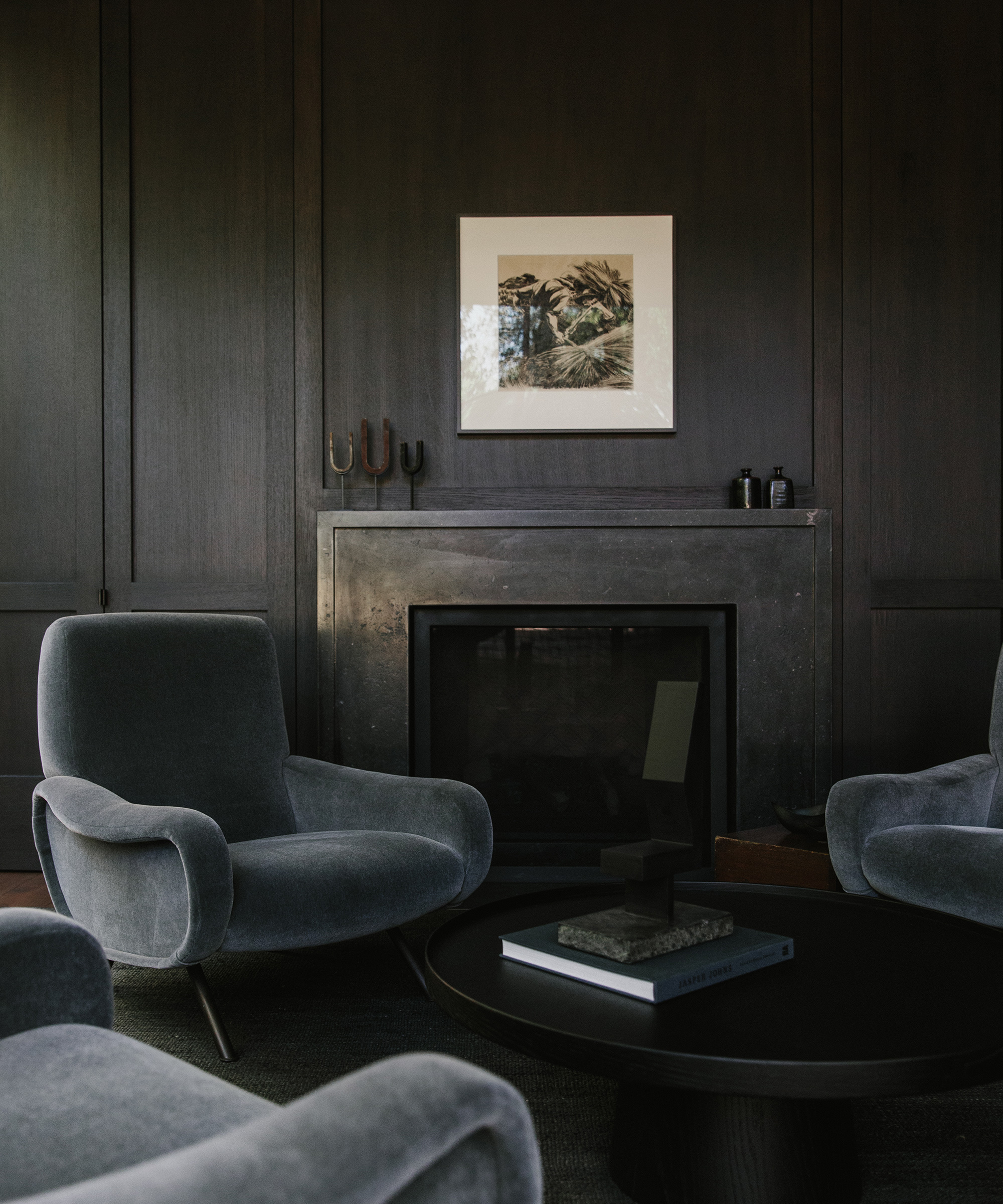
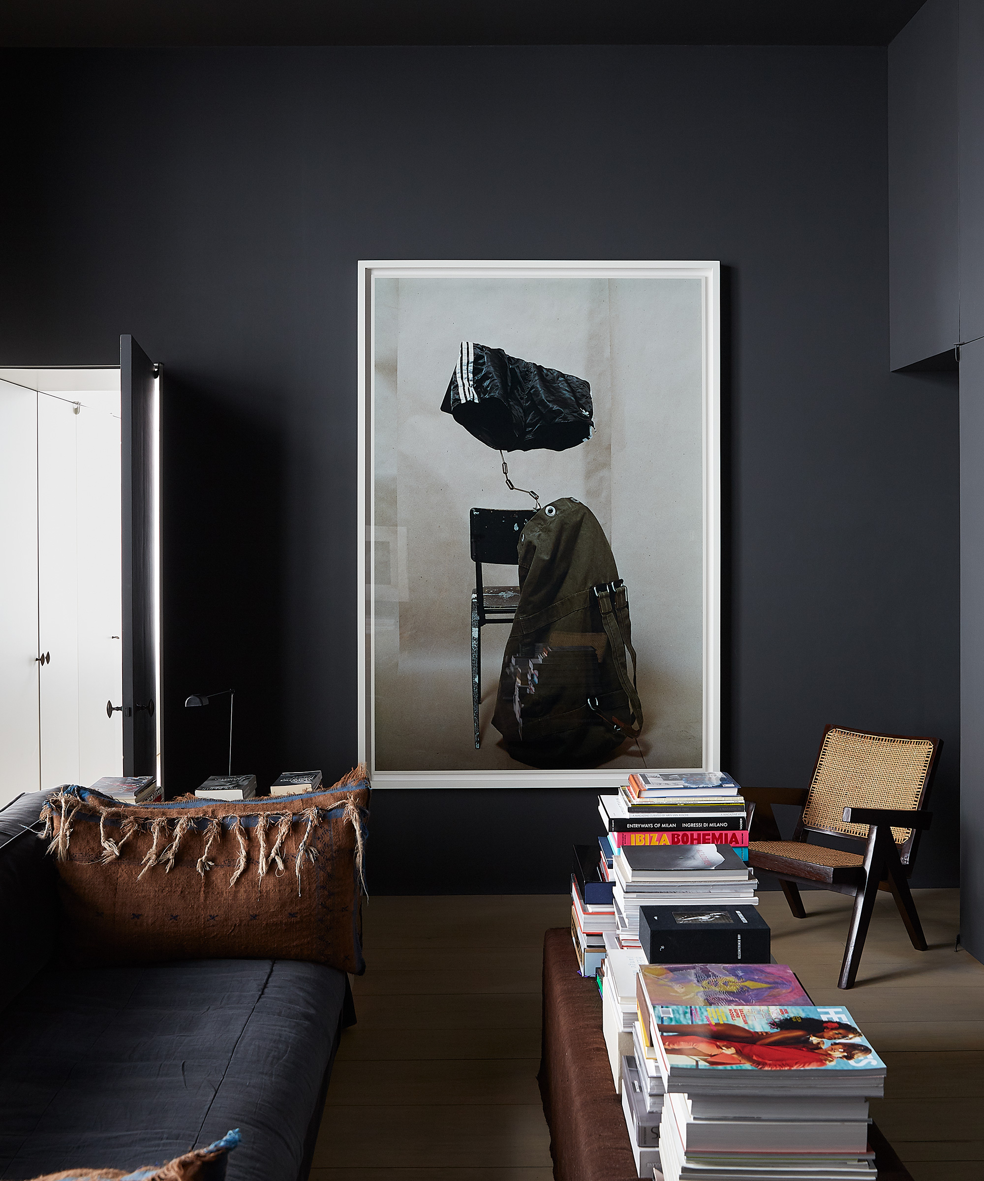
Linnea Schooley: Anywhere you want to give some more depth or make feel more cozy or intimate. People often gravitate towards lighter and brighter neutrals, but darker tones are equally as timeless if you approach them with an eye for balance.
Rip & Tan: How can you go darker without making a room feel small or the color seem overbearing?
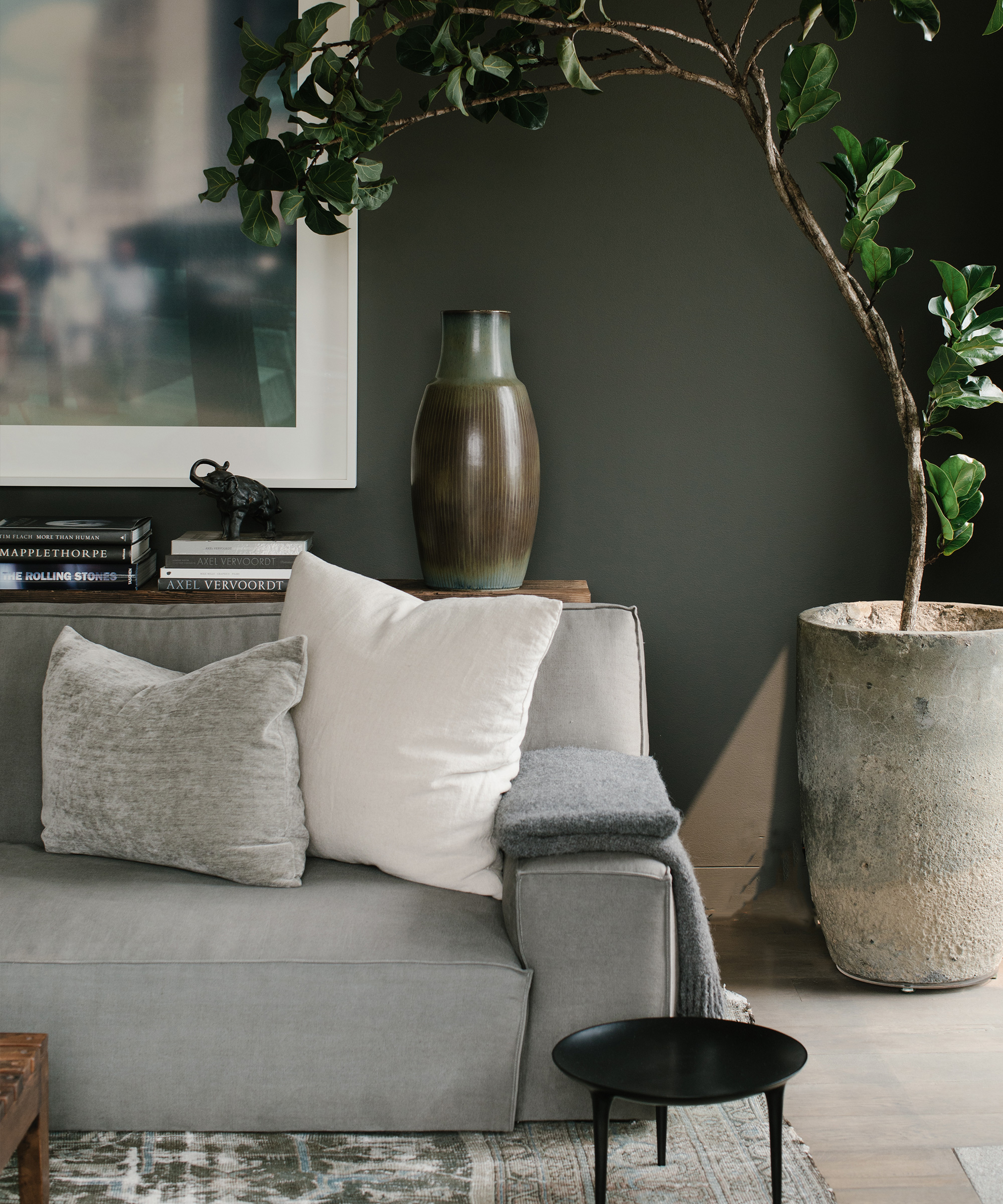
Linnea Schooley: Paint becomes more saturated the larger a space it covers, so to make it feel less overbearing I would stick with neutral tones that bring in undertones of whatever color you’re itching for.
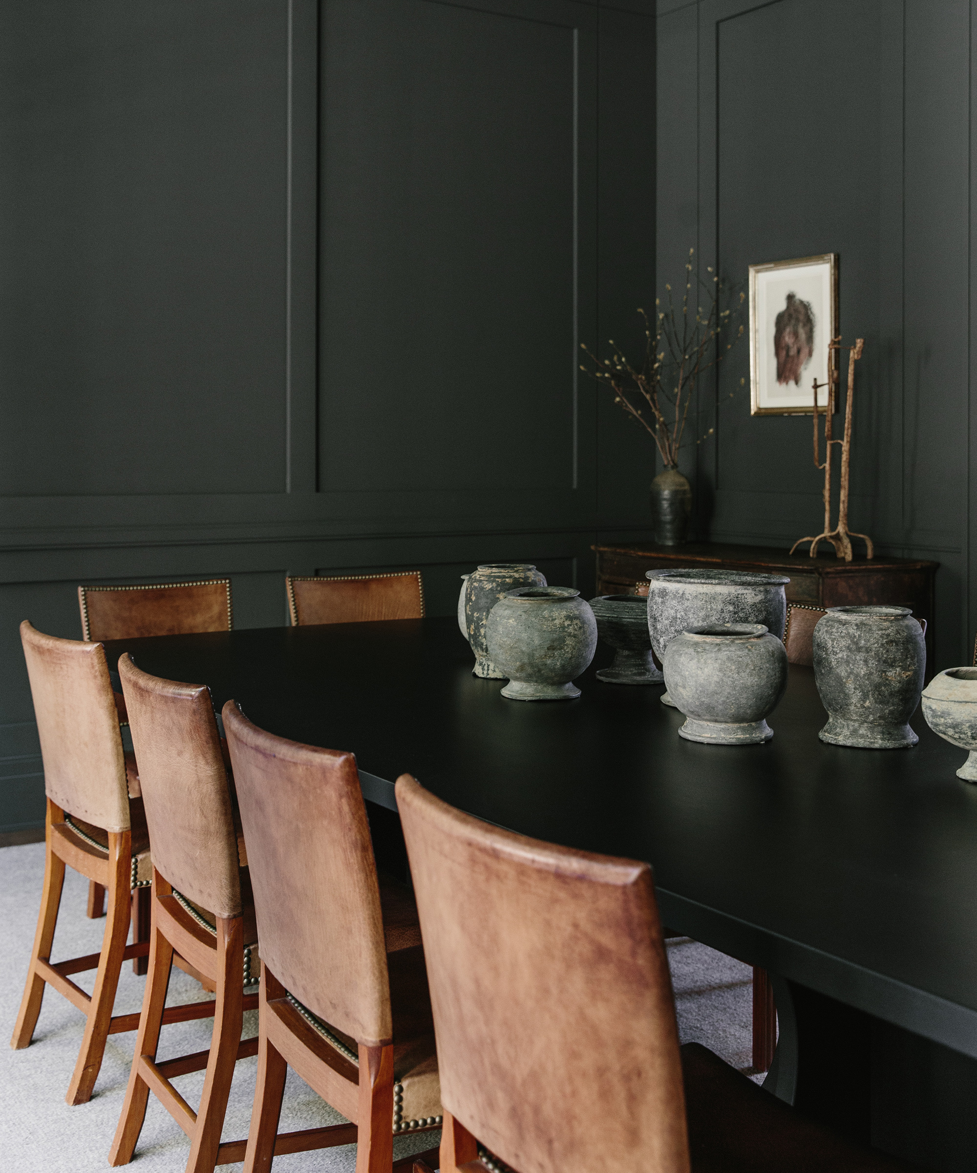
I also like to keep all of the walls, trim, and ceiling the same color to keep everything cohesive.
Rip & Tan: Anything to keep in mind when choosing darker colors in terms of balance?
Linnea Schooley: Keep in mind that paint looks very different in different spaces. Always, always, always paint a decent size swatch on the wall before you commit to the whole room.
Rip & Tan: Are there any color pairings you think work well together?
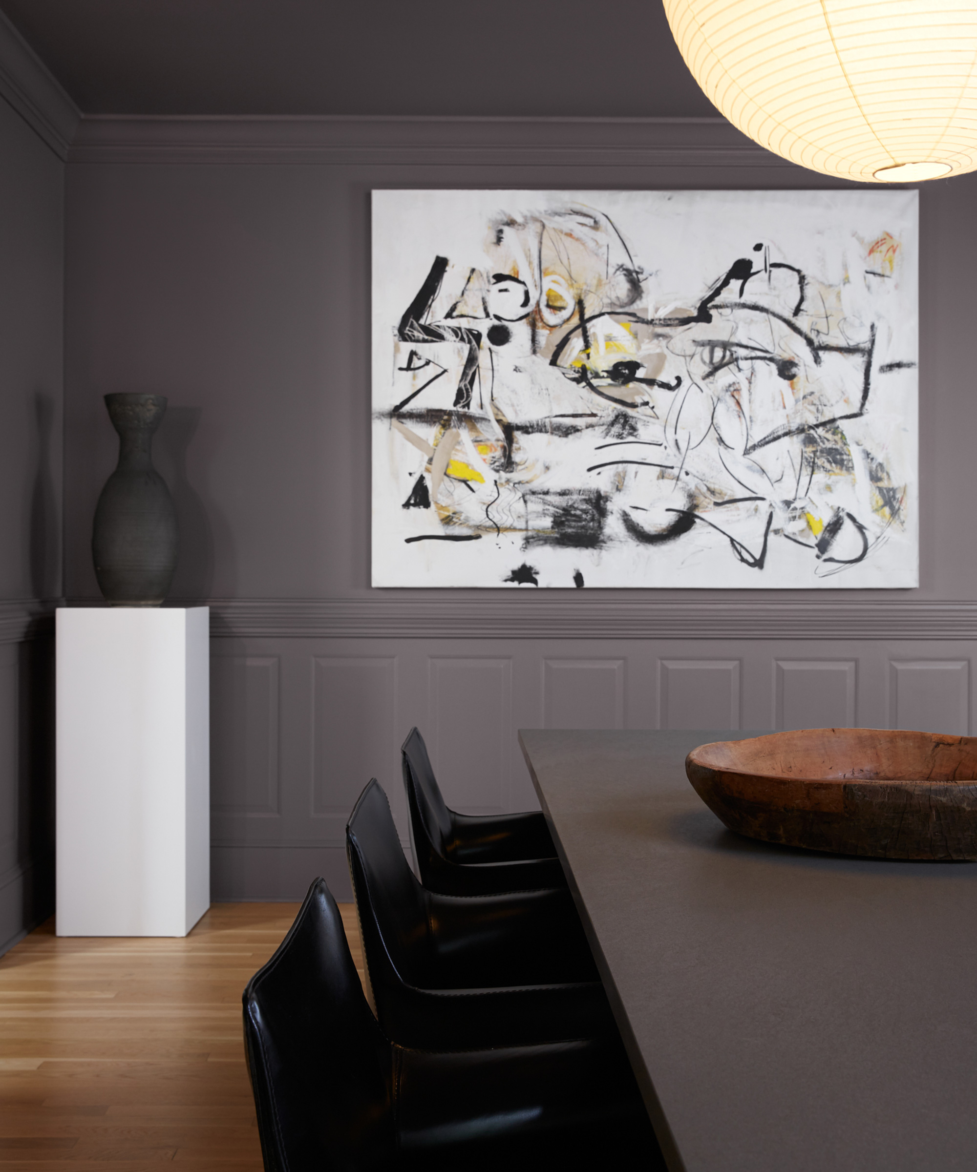
Linnea Schooley: I think going tonal is always fun! For instance, if you have a dark grey paint color, focus on muted grey furnishings with darker accents.
But if you’re hesitant to go dark, you can always bring in some lighter furniture to keep the space feeling brighter.
Rip & Tan: Are there any particular rooms that lend themselves more easily to darker hues?
Linnea Schooley: Powder bathrooms, theatres or TV rooms, libraries, or dens are all great rooms for darker tones! Rooms that are generally smaller or where you’re less inclined to use natural lighting and more inclined to use mood lighting.
I like to keep bedrooms light, but you can always add in moodier accents to create some tonal dimension.
"People often gravitate towards lighter and brighter neutrals, but darker tones are equally as timeless if you approach them with an eye for balance."
Rip & Tan: How should darker colors work with the rest of your home?
Linnea Schooley: Bring some darker elements into other rooms in your home, through furniture pieces, accessories, cabinetry, and so forth to keep things balanced and feeling cohesive.
Rip & Tan: How can we use darker colors as an accent?
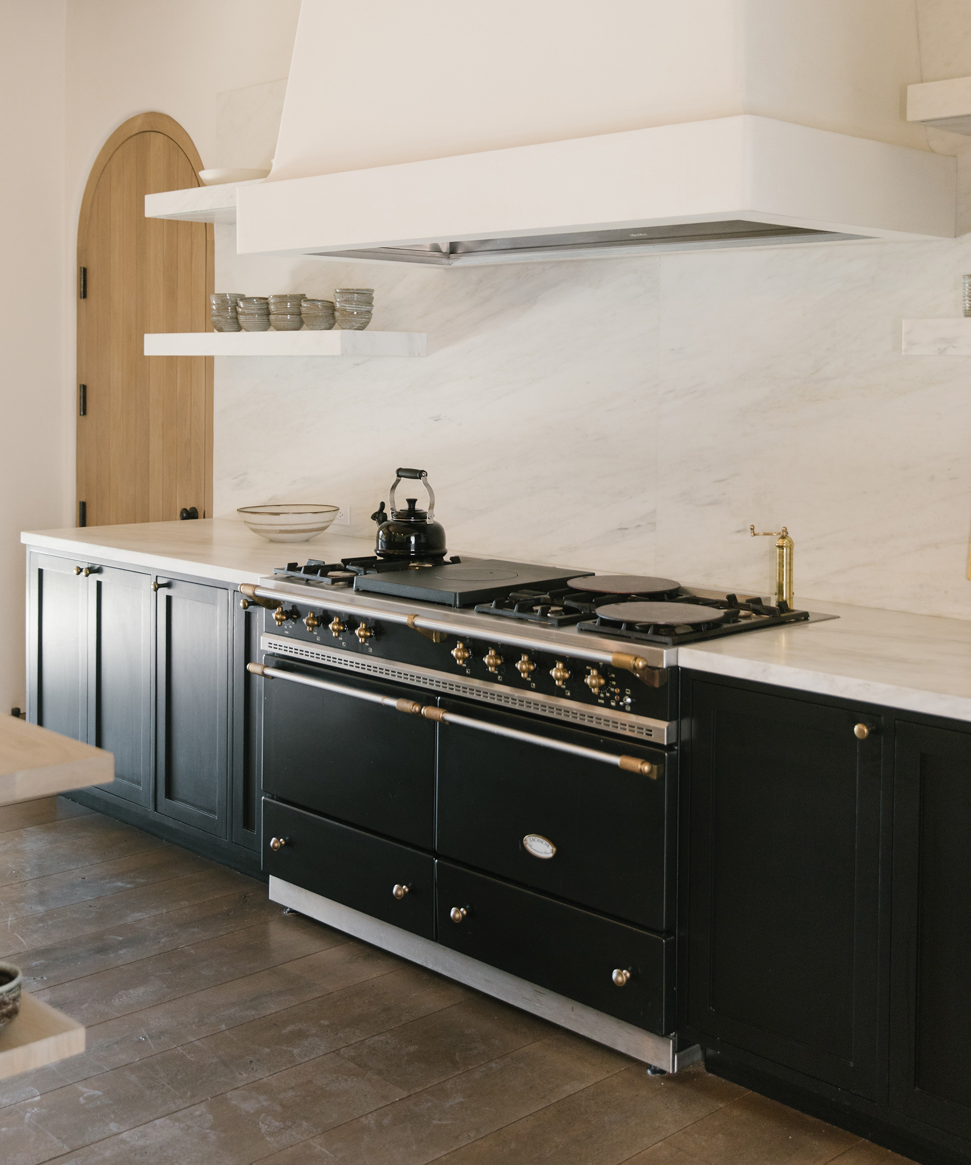
Linnea Schooley: Cabinetry or built-ins are a great way to bring in darker paint colors as accents without committing to a whole room!
Rip & Tan: What types of finishes and wall treatments would you suggest for a deep-toned space?
Linnea Schooley: I love keeping finishes in similar tones but different textures. You can play around with aged stone, darker metal, and rich woods that all speak the same language.
Rip & Tan: Do you have any tips for embracing a moodier palette throughout your entire home?
Linnea Schooley: I’d suggest varying the tones used throughout your home so that rooms feel unique but cohesive. For example, using an off-white paint with grayer undertones in the main living space and a medium-toned or dark gray in the powder room will help create a tonal experience that feels in sync.
Rip & Tan: What advice would you give to someone wanting to layer multiple moody hues in a single space?
Linnea Schooley: One easy way to ensure multiple tones are cohesive is to use all warm or cool undertones. I tend to gravitate towards warmer undertones because they exude coziness and warmth, but cooler undertones are equally as eye-catching and can tie a moodier room together with ease.
Photos by Angi Welsch Kasia Gatkowska Nicki Sebastian